First impressions are everything, and what else is a book cover but a reader’s first impression of your story?
What monsters will the protagonist face in this novel? they’ll ask, turning your book over in their hands.
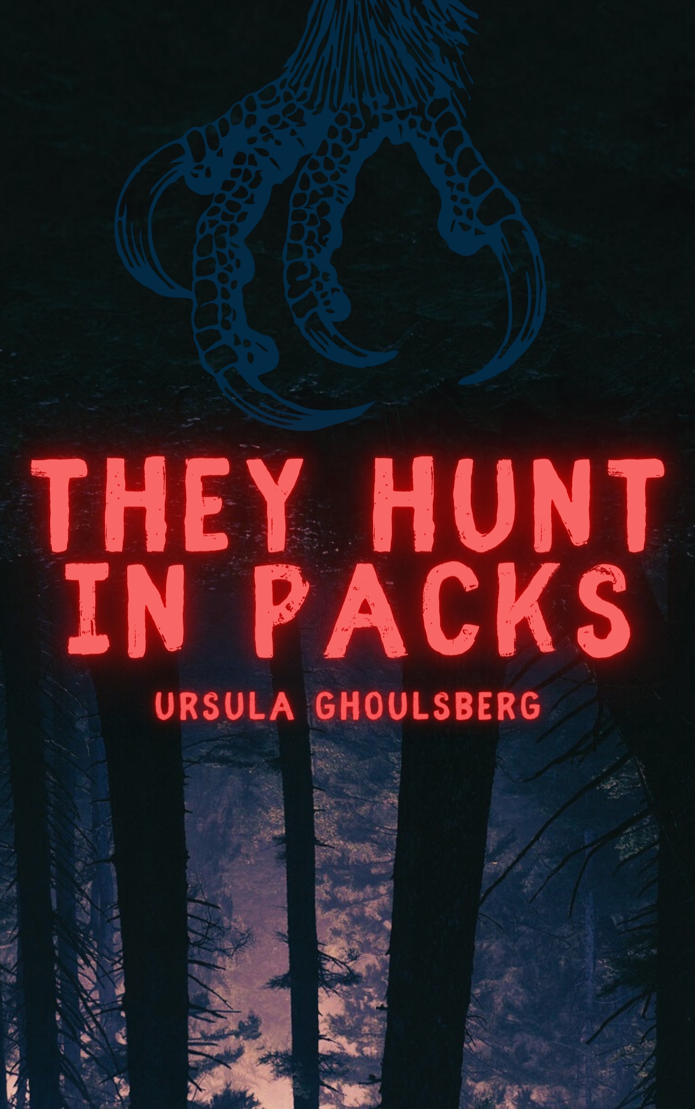
A horror book cover might use imagery that separates a werewolf novel from a vampire novel—claw marks and full moons versus blood drops and bats.
And is this romance novel funny or sad? The right typeface on a romance book cover alone can tell a reader at a glance.
But how? What ancient and otherworldly magic is this? No magic here—you, too, can create a compelling book cover, one that helps clinch that sale, with a basic understanding of art theory and book marketing. And if you can’t, don’t worry! There are websites overflowing with freelance graphic designers hungry for their next commission.
Book cover design basics
All book covers place two things on full display: the title and the author’s name. (Did we really just tell you this as if you didn’t already know?)
A book cover design usually contains imagery apart from the text, but some prioritize the typography and color choices to draw the eye and intrigue the mind:
Depending on where you plan to publish—in print, online, or both—our book cover design may also include back matter (a brief, tantalizing description of the story usually found on the back cover or inside the dust jacket) or blurbs from popular reviewers or other authors praising the work or its creator.
Other book cover design essentials
Taste is not universal, but for the purposes of this blog post, we’re going to judge book covers based on the following principles:
- Color and composition: In concert with the text and imagery, the color palette and arrangement of design elements send subconscious and emotional messages to book browsers.
- Legibility: Creative fonts can help you stand out, but you want people to be able to remember your book title, which means it needs to be easy to read.
- Readership: A good book cover appeals directly to its audience, including the age of their readers and genre expectations.
- Consistency: Writing a series? Then your book covers should have matching art styles so readers know they’re a package deal.
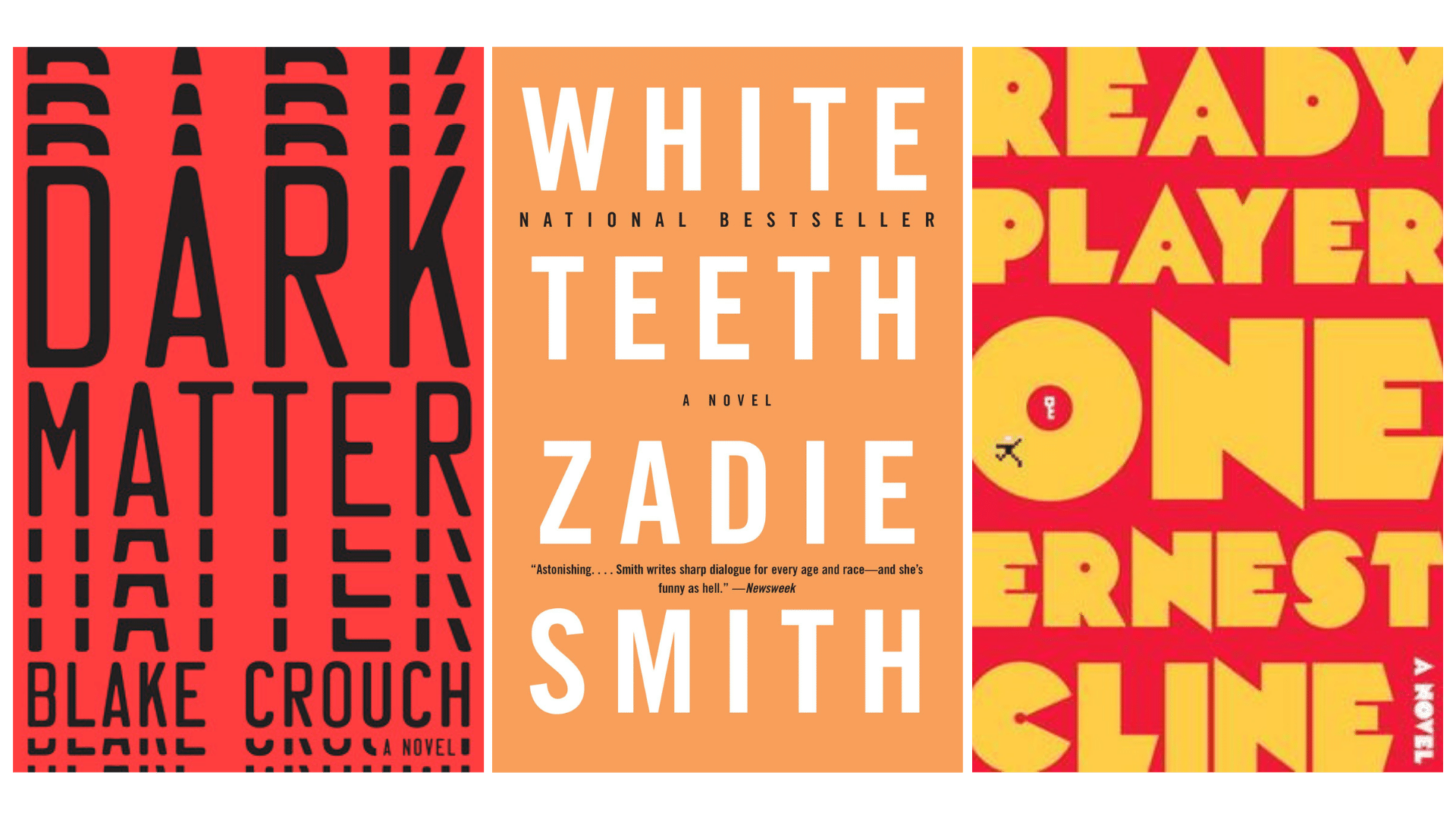
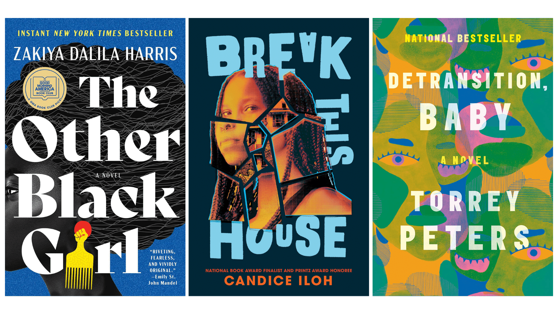
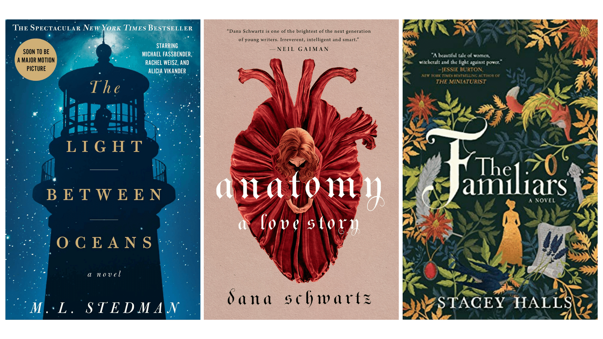
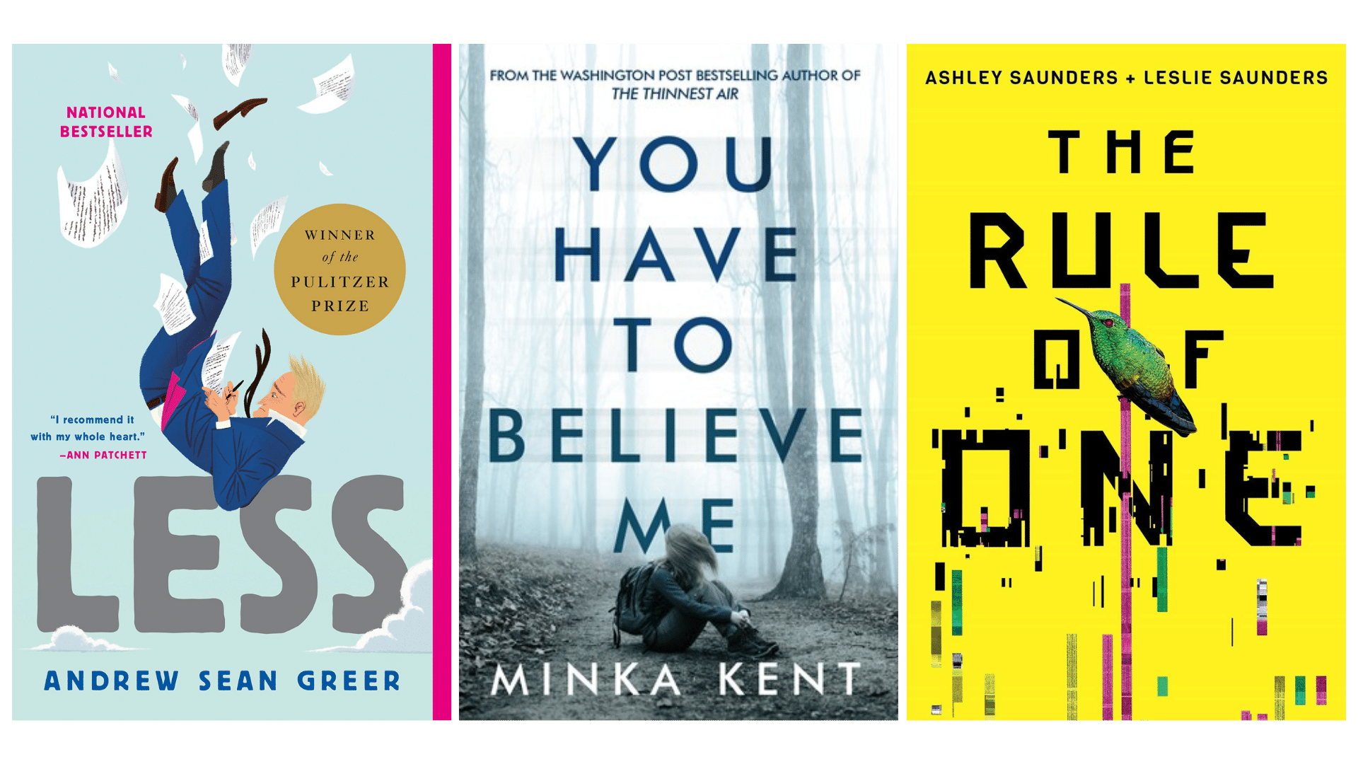
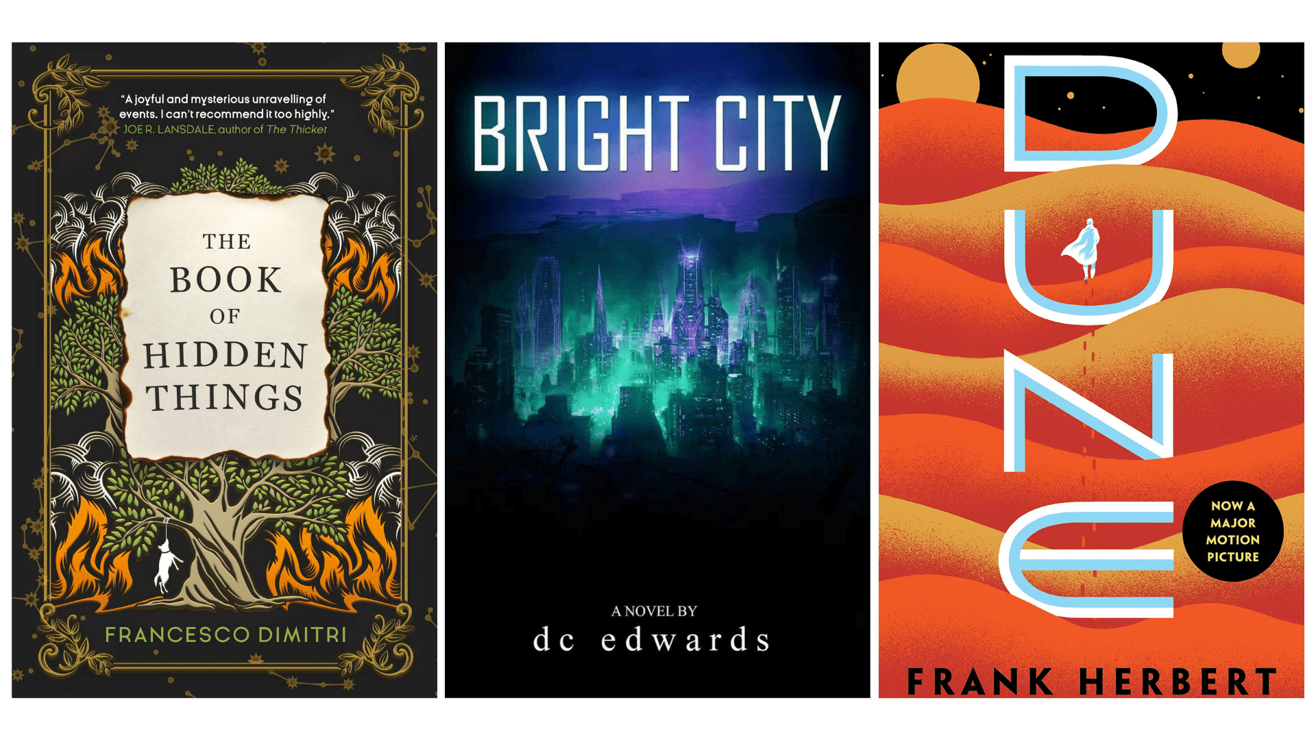
Famous book cover designs of 2021
Let’s look at a few book covers that appear in many “best of 2021” lists and how they align with these basic principles:


Stock image libraries
Interested in photography or illustrations for your book cover design, but don’t want to rely on smartphone snapshots or awkward stock imagery?
Good news! Stock photos and illustrations today aren’t as expensive or inaccessible as they used to be. Check out these stock image libraries:
When browsing these sites, be sure to check whether the images you like are cleared for commercial use, assuming you plan on selling your novel. And if you find something you like that isn’t free, it’s usually only a couple of bucks—a steal for the right artwork.
If you do incorporate an artist’s work into your book cover design, don’t forget to credit the artist in the front matter (the page at the beginning of every book where the ISBN information is). Often attribution isn’t required, but that doesn’t mean you shouldn’t do it.
Typography 101
When it comes to choosing typeface for your book color, there are two things to consider: hierarchy and serifs versus sans serif typefaces.
Hierarchy is the selection of typeface, size, color, and composition for your text elements to draw the eye to the most important information and then move it to what’s next. We’re using hierarchy in this very blog post—notice how our headings and subheadings are different sizes, thicknesses, and colors? That’s hierarchy.
The hierarchy lesson for today is simple: Unless you are already a well-known writer (Stephen King, are you reading this?), your title is your most important piece of information, and your name is second place. As such, your title should be more prominent than, or as prominent as, your name. How you illustrate this prominence, through size, color, or composition, is up to you.
Typefaces, or fonts, come in two flavors: serif and sans serif. Serifs are the embellishments on letters.
The typeface we use here is sans serif, meaning without those serif embellishments.
Serif typefaces evoke in many a sense of the traditional and the established, of elegance, class, and timelessness.
Sans serif typefaces are hip and modern. They’re more casual, friendlier, and more approachable—some would even say more human.
When designing your book cover, stick with one or two typefaces only, and feel free to mix serif and sans serif.
If you’re having trouble deciding which typeface to use on your book cover, research popular examples from novels in your same genre. Try out different fonts, and ask yourself: Does this font match the tone and style of my novel? Your beta readers and editors can always weigh in on this.

Color theory 101
When selecting a color scheme for your book cover, focus on their distances from each other along a color wheel.
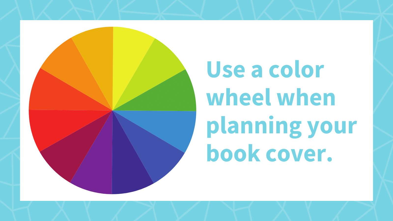
In case you need a refresher: Colors across from each other on the color wheel are called complementary colors. Colors next to each other are called analogous colors. Complementary colors have intense contrast, creating a lot of pop, whereas analogous colors are calmer and more comfortable on the eyes.
To create a simple color scheme, start with a color, take the two colors on either side of it, lighten or darken those colors for additional options, and you’re done! That’s an analogous color scheme.
Want a palette with more contrast? Try a complementary or split-complementary color scheme, which pairs hues across the color wheel. To dial back contrast, pivot along the wheel or lighten or darken the colors.
For example, say you want to use the complementary colors purple and yellow, but woah! That’s way too intense! You can rotate along the color wheel so that yellow becomes orange or green, or you can substitute the pure hues for shades or tints, like golden yellow and deep purple. For complementary color palettes, consider including a neutral color like white, gray, or black to take advantage of that complementary energy.
The internet is rife with lists on the psychology of colors, and we’ll leave it up to you to decide what colors best represent the story you want to tell, and for what reason.
But for those who are struggling to start, draw inspiration from other authors in your genre. Go to your bookshelf and pull out a few of your favorites, the novels that inspired you to write the story you’re designing a cover for. How does the color palette express the characters, the narrative, or the mood?
Also, fall back on genre conventions, the colors that might feel ridiculously obvious—black and crimson for horror or romance, neon blue and purple for science fiction.
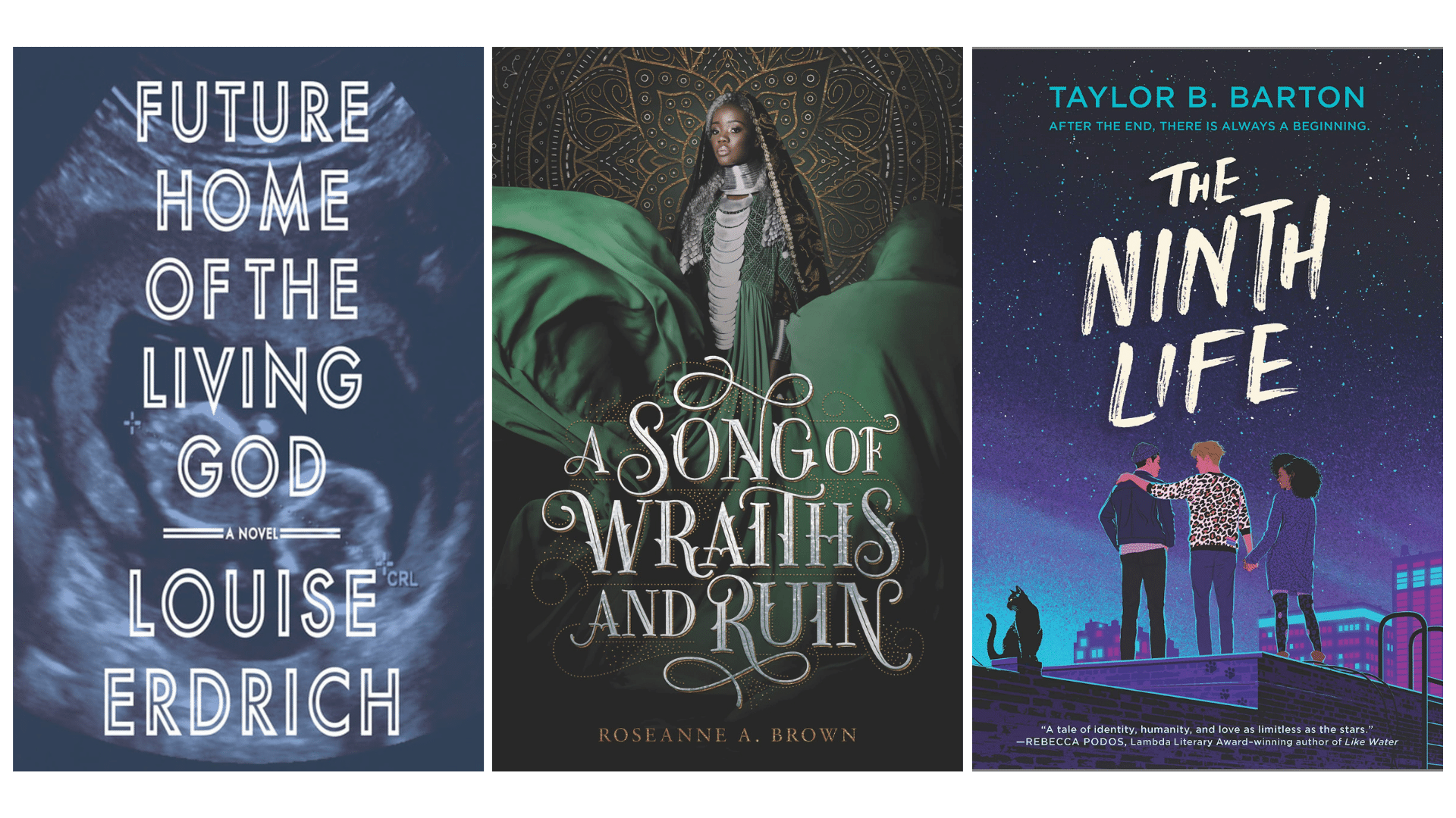
Sample book cover designs
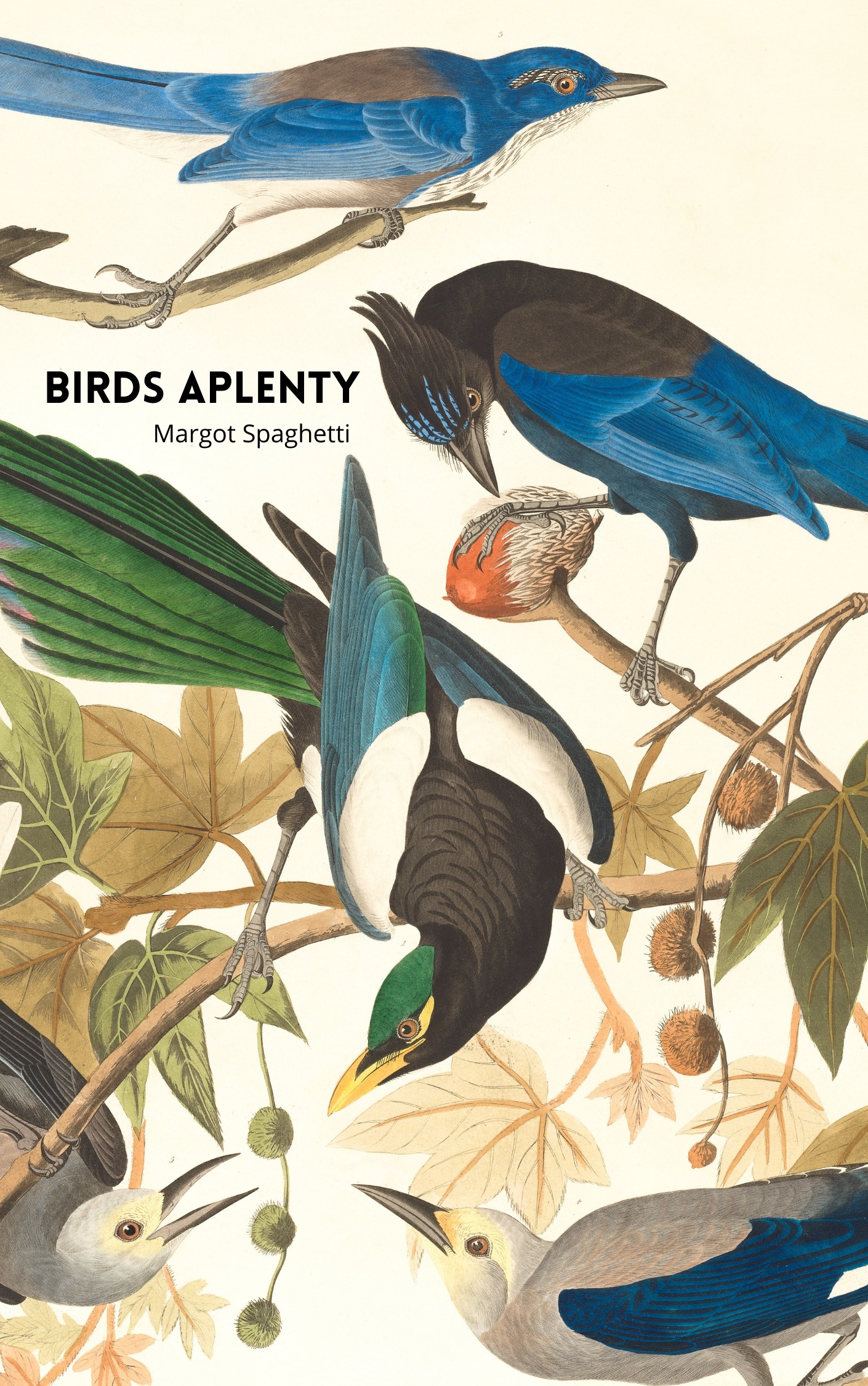
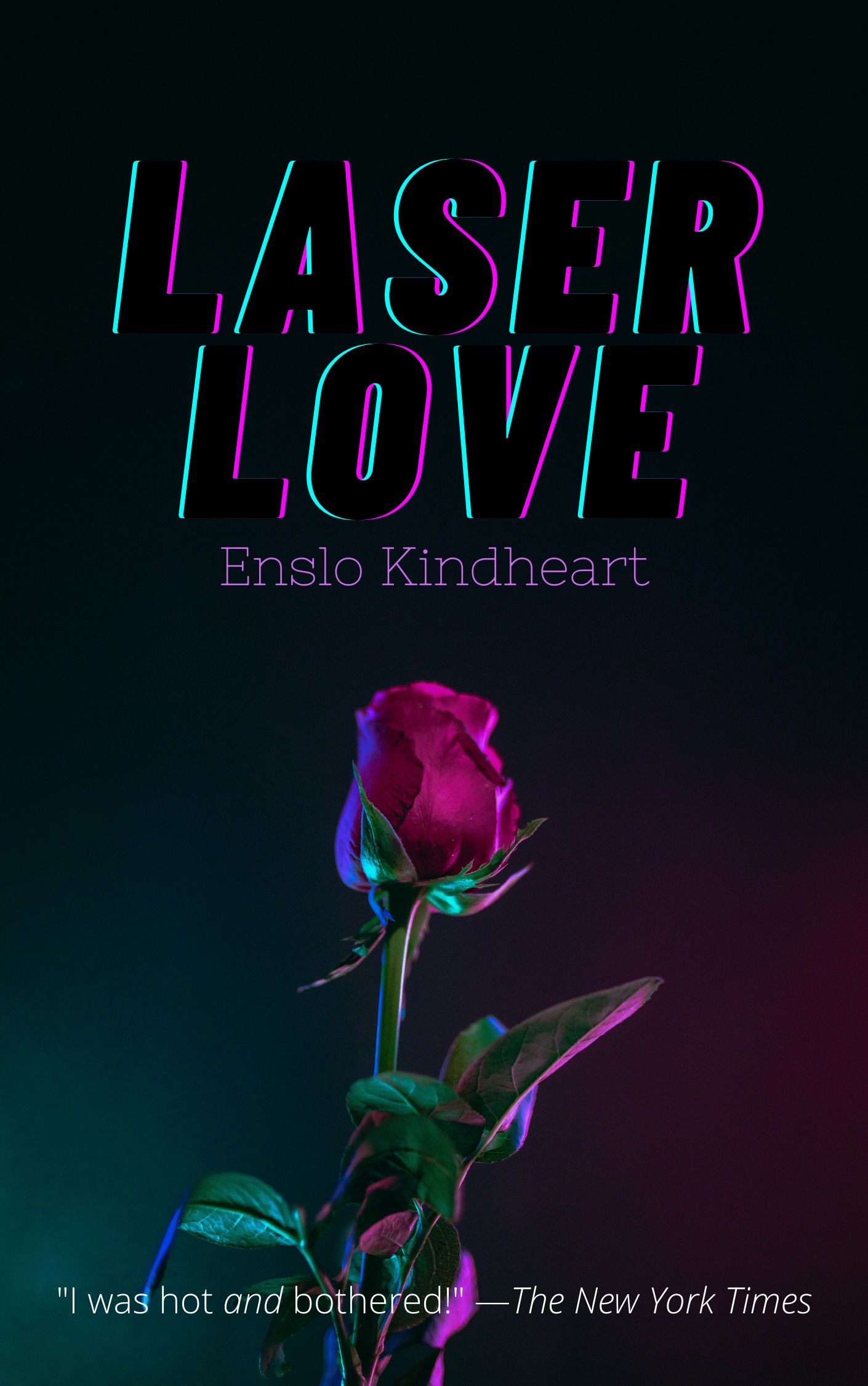
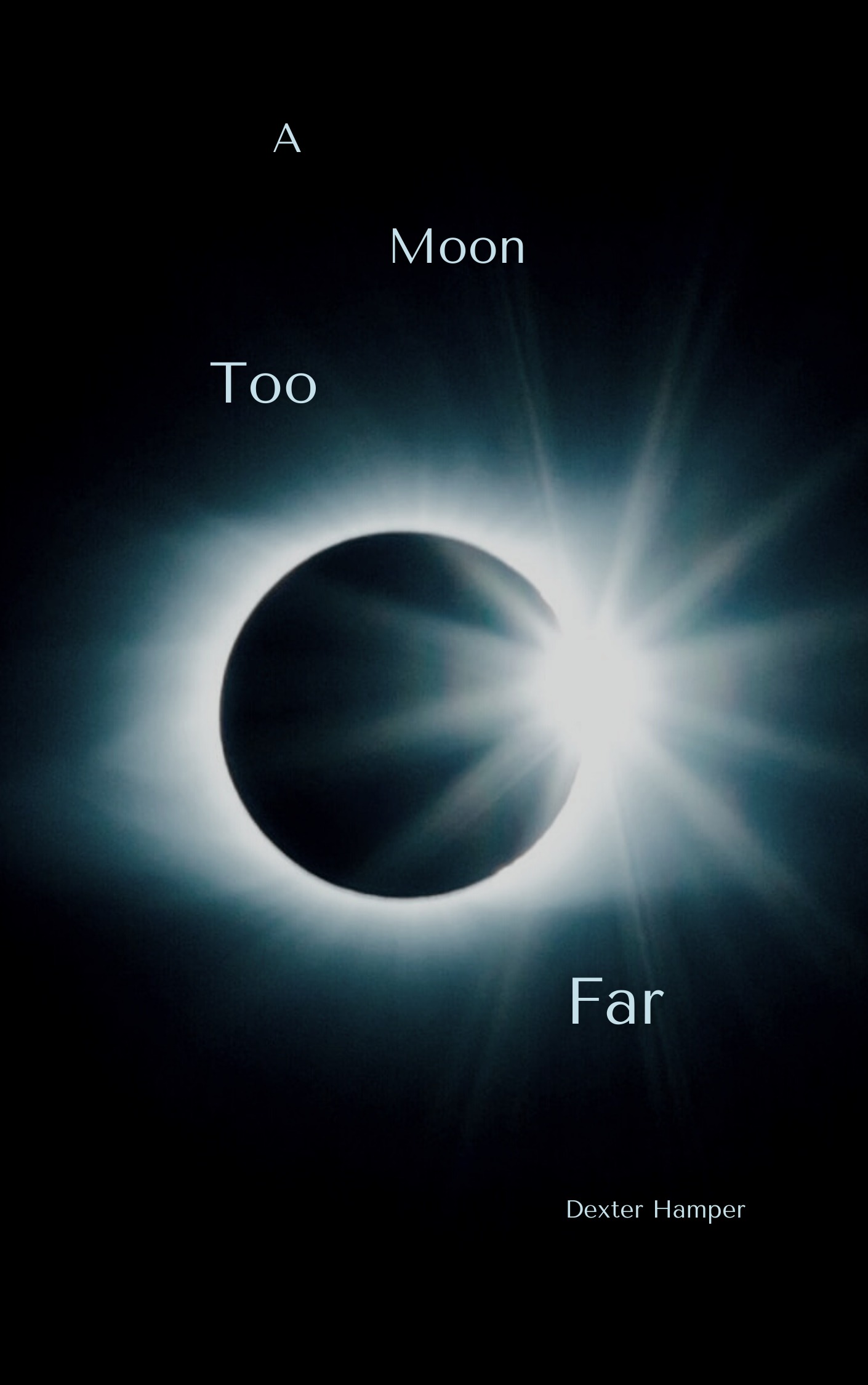
Using the tools and techniques listed above, I created a gallery of fake book covers, some in a matter of minutes.
Do any of these look like something you might check out of the library or buy online? Then our work here is done!